Redesign of Politecnico di Milano Mobile App
Redefine the access and the digital experience of academic services
Time
April 2021
Client
Politecnico di Milano
Project Type
UX/UI Design
Role
UX Designer
Tools
Figma, Protopie, Arduino
Problem outline
The brief has been set by Politecnico di Milano and it was pretty clear: redesign the mobile experience of academic services offered to students.
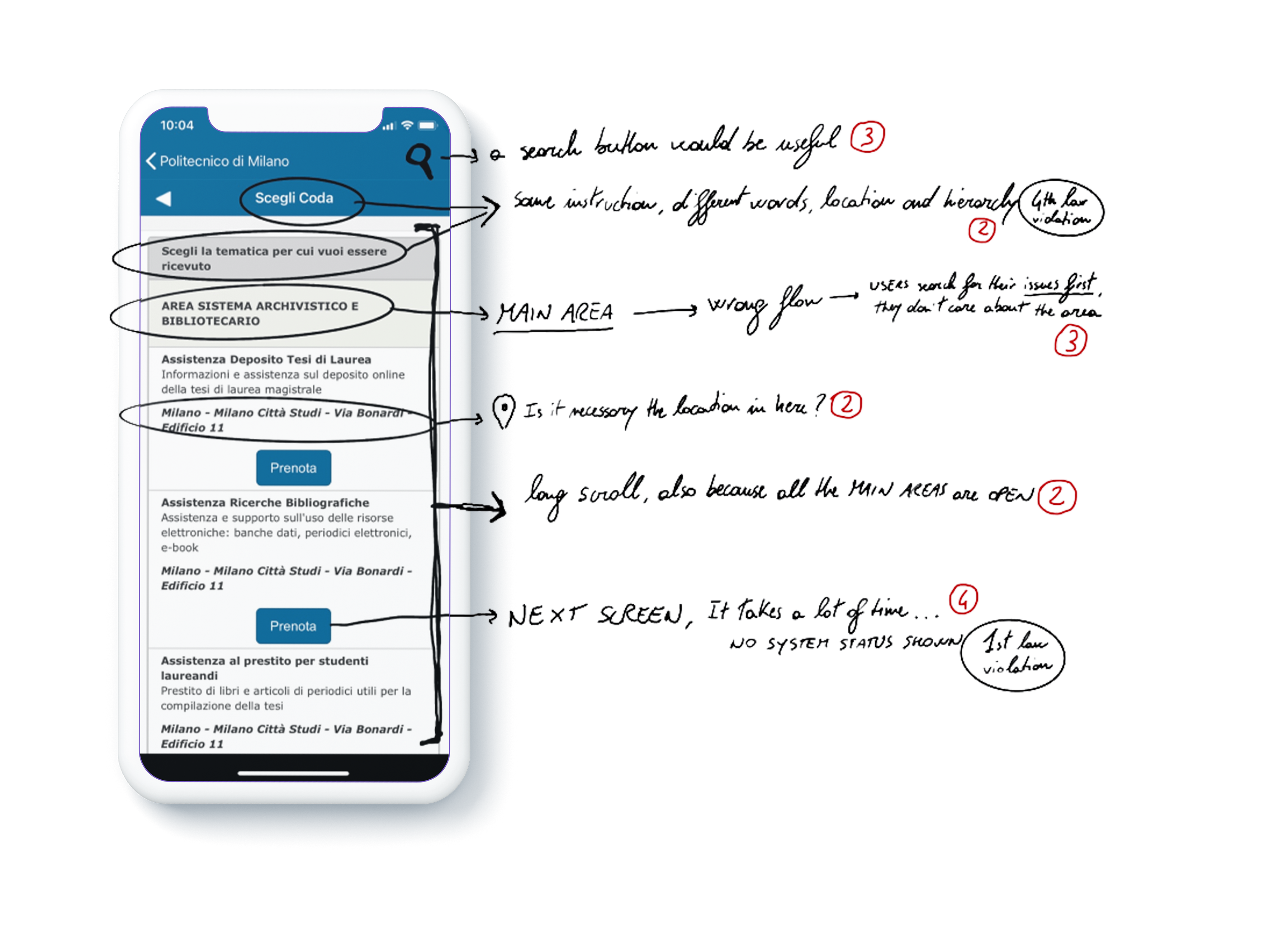
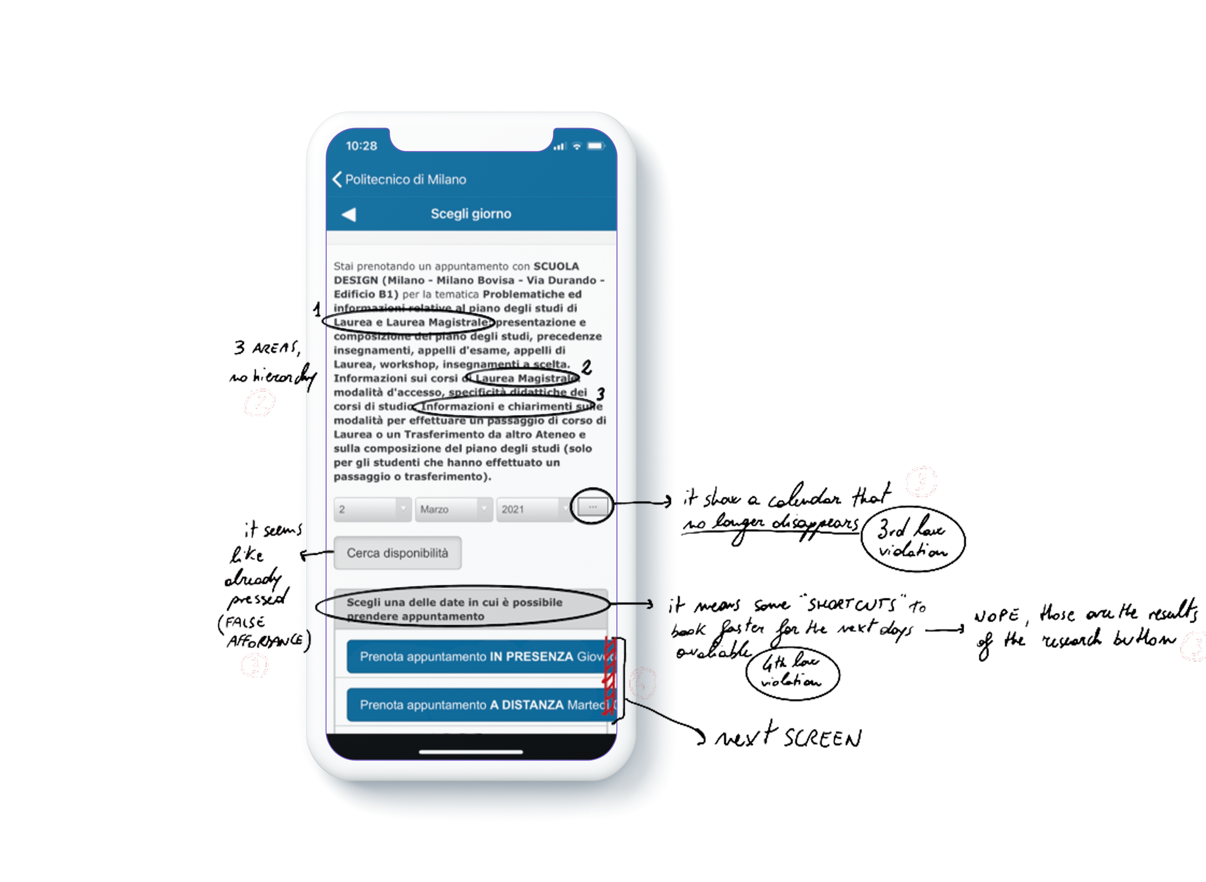
As shown in the picture, actual UX architecture and UI are just too old and poorly designed. As a consequence, students are keen to prefer desktop access even for the simplest tasks.
Research strategy
Concerning the research phase of this project, the strategy featured two main stages.
An initial Expert evaluation through an analysis of the heuristics highlighted a systemic lack of Visibility of system status, a constant and non-hierarchical information overload, and a misuse of affordances in the User Interface.
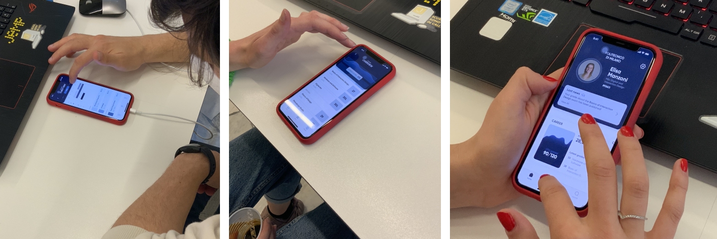
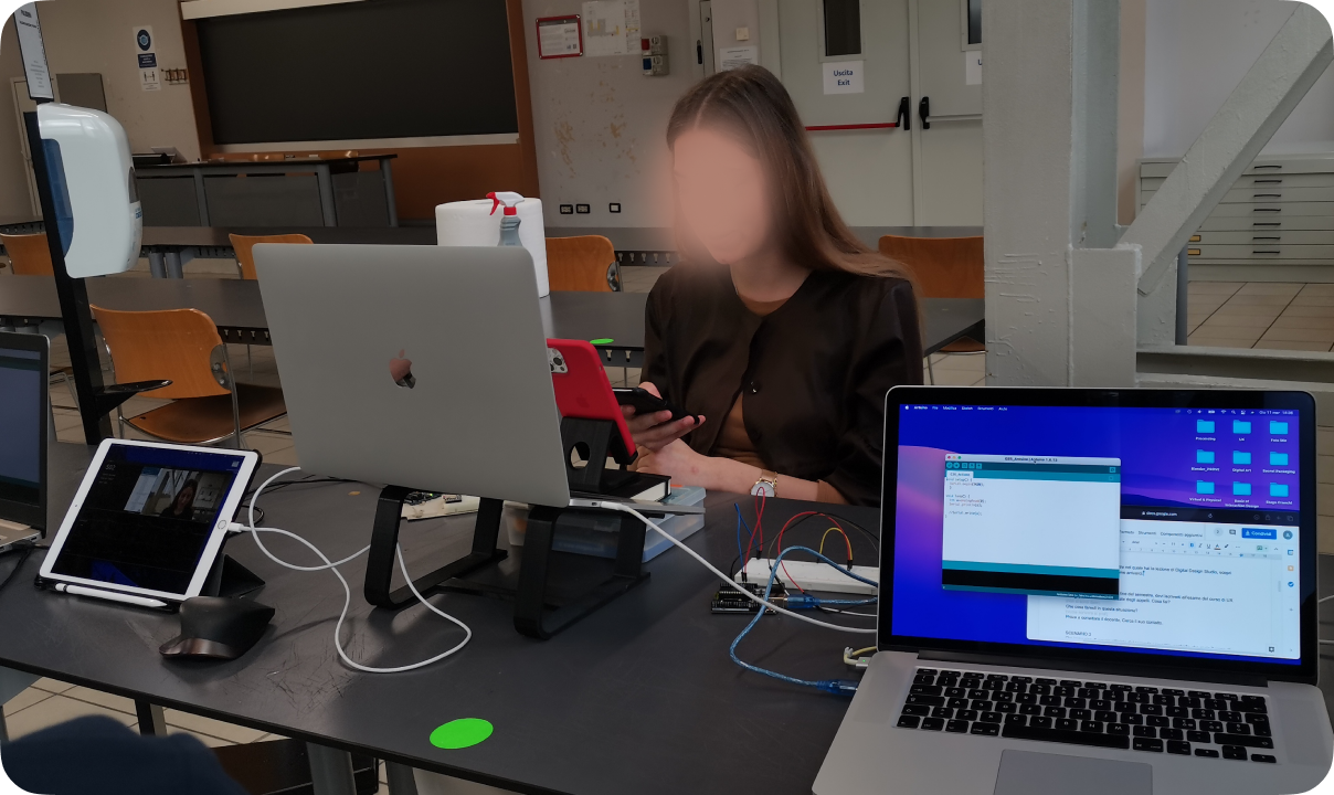
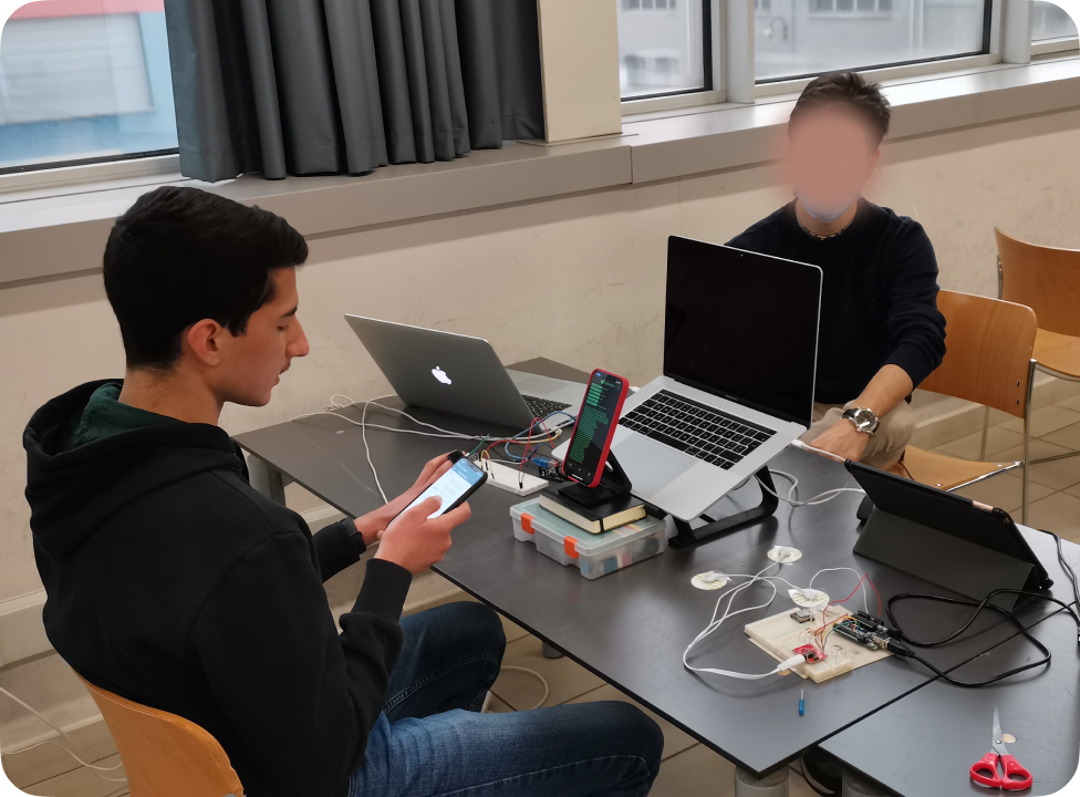
Later on, user testing and analysis with the current application took place. Exploiting behavioral tools of ECG, EDA, and custom software for emotion recognition through facial movements allowed us to spot the exact moments of the interaction with the app that causes frustrations and arousal in users.
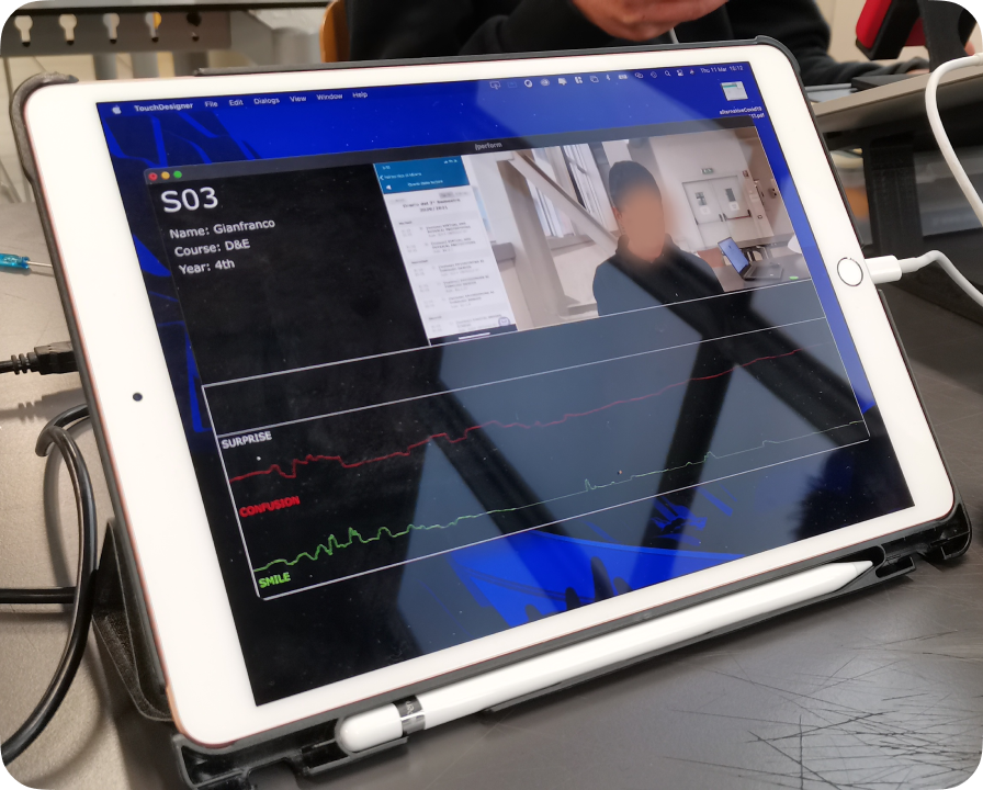
The most frequent context of the use of a student’s app is on the run while reaching the campus. Considering this, the most crucial lack of the actual version regards a critical level of responsiveness of the app and a large number of useless functionalities.
Concept design and development
Considering the main insights inferred from the research, the structure of the new pillars focused on a different strategy made by three main factors:
Customization
Different students mean different careers, hence different needs in terms of services and information display
Increase Speed
The new architecture should take into account when the experience takes place. Mostly on the go, with very little amount of time to accomplish the tasks
Smarter Hierarchy
What students need most and mainly is a way shorter amount of features than the one they have now. For this reason, giving a different level of importance to features could help in making those that are most crucial easier to reach.
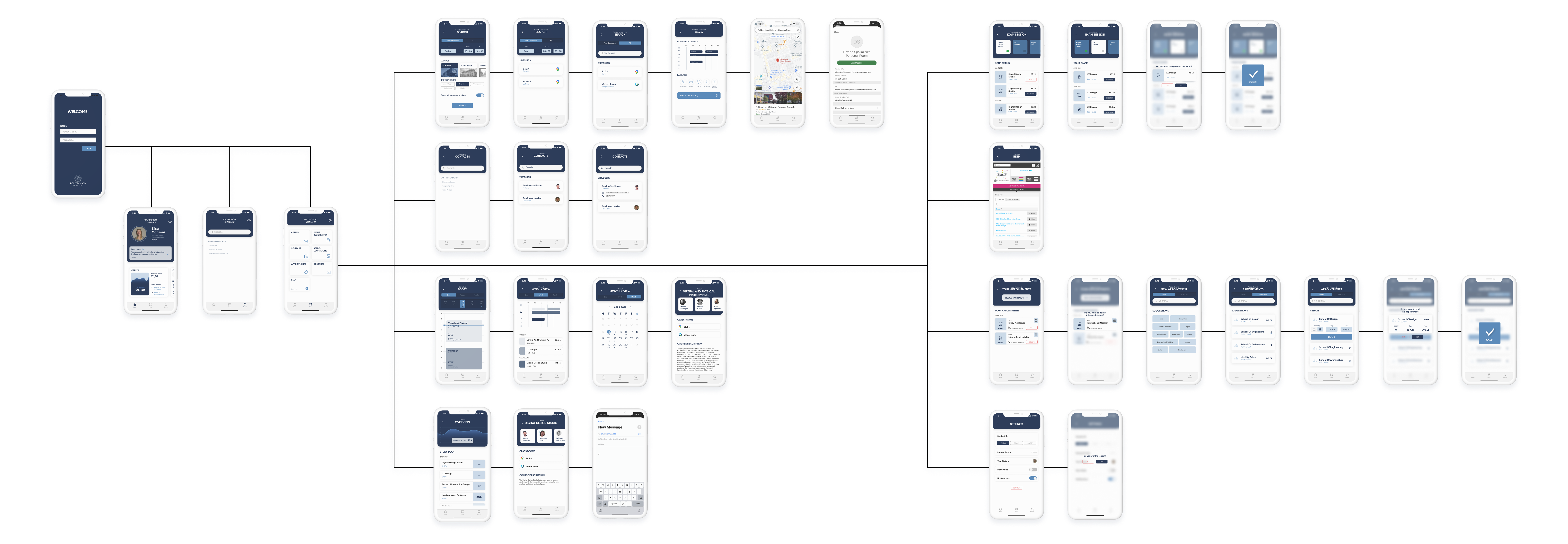
Information Architecture
This step has been conducted with the help of users, exploiting techniques like Card Sorting and Tree Testing. These techniques allowed us to implement incremental improvements in the many iterations toward the final setup.
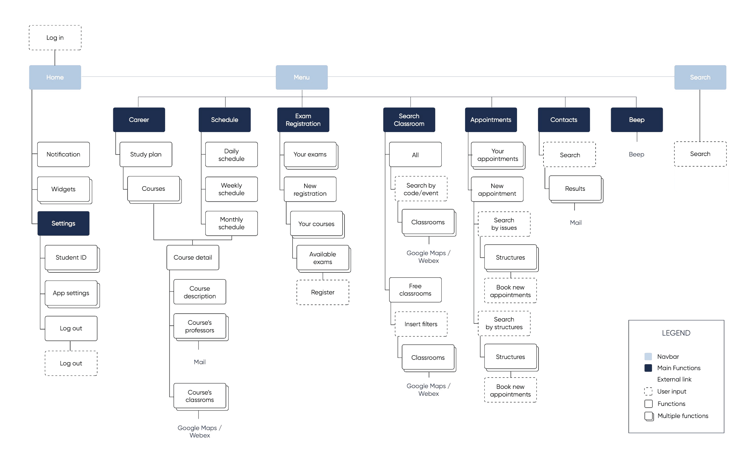
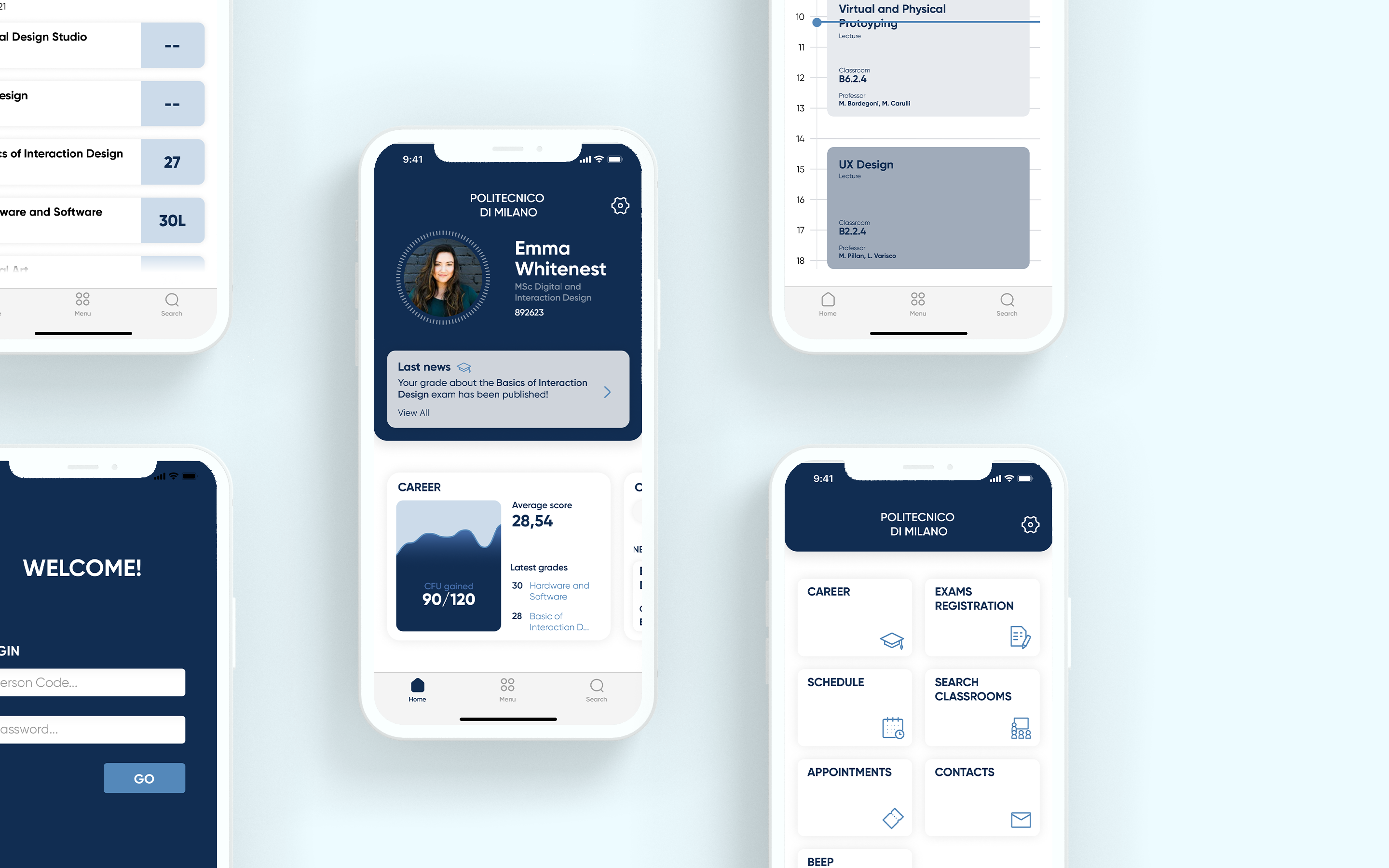
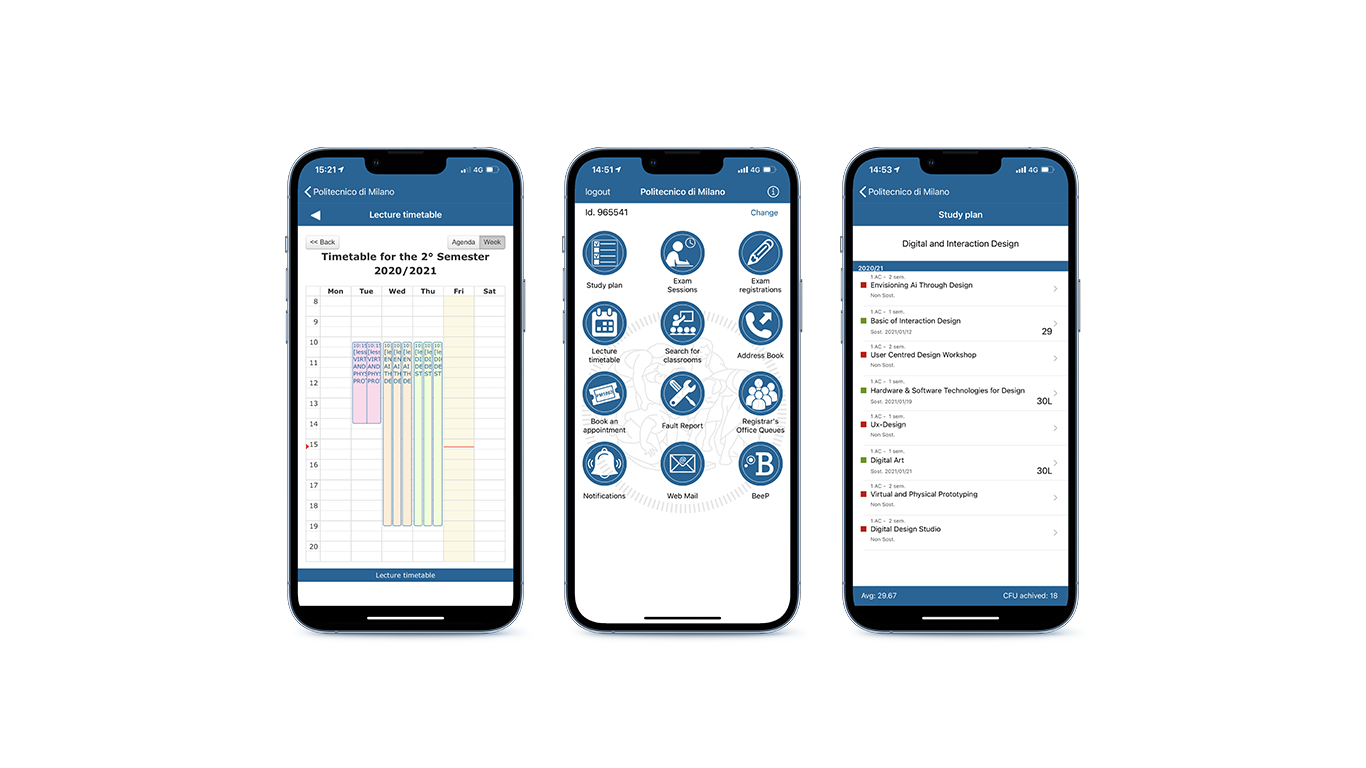
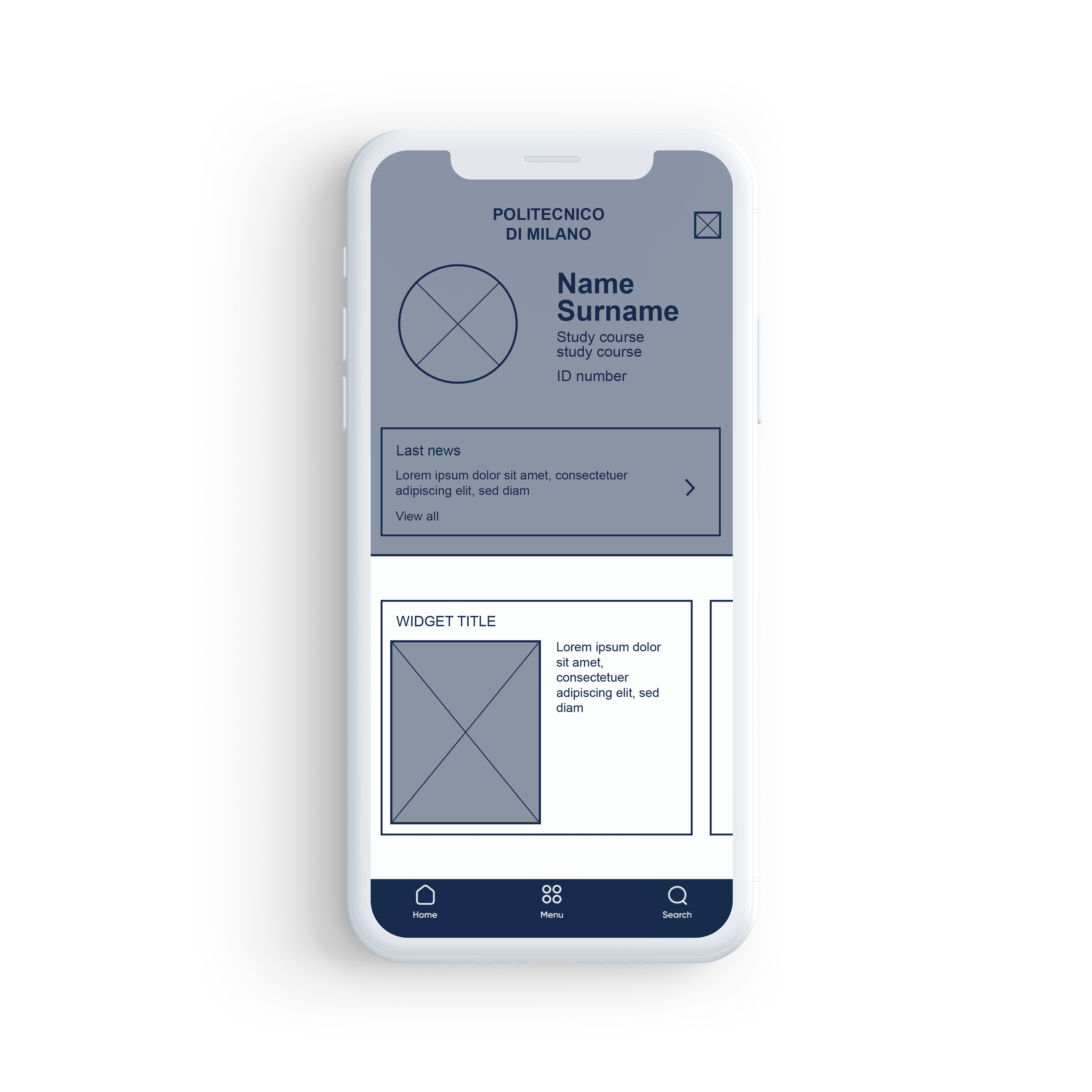
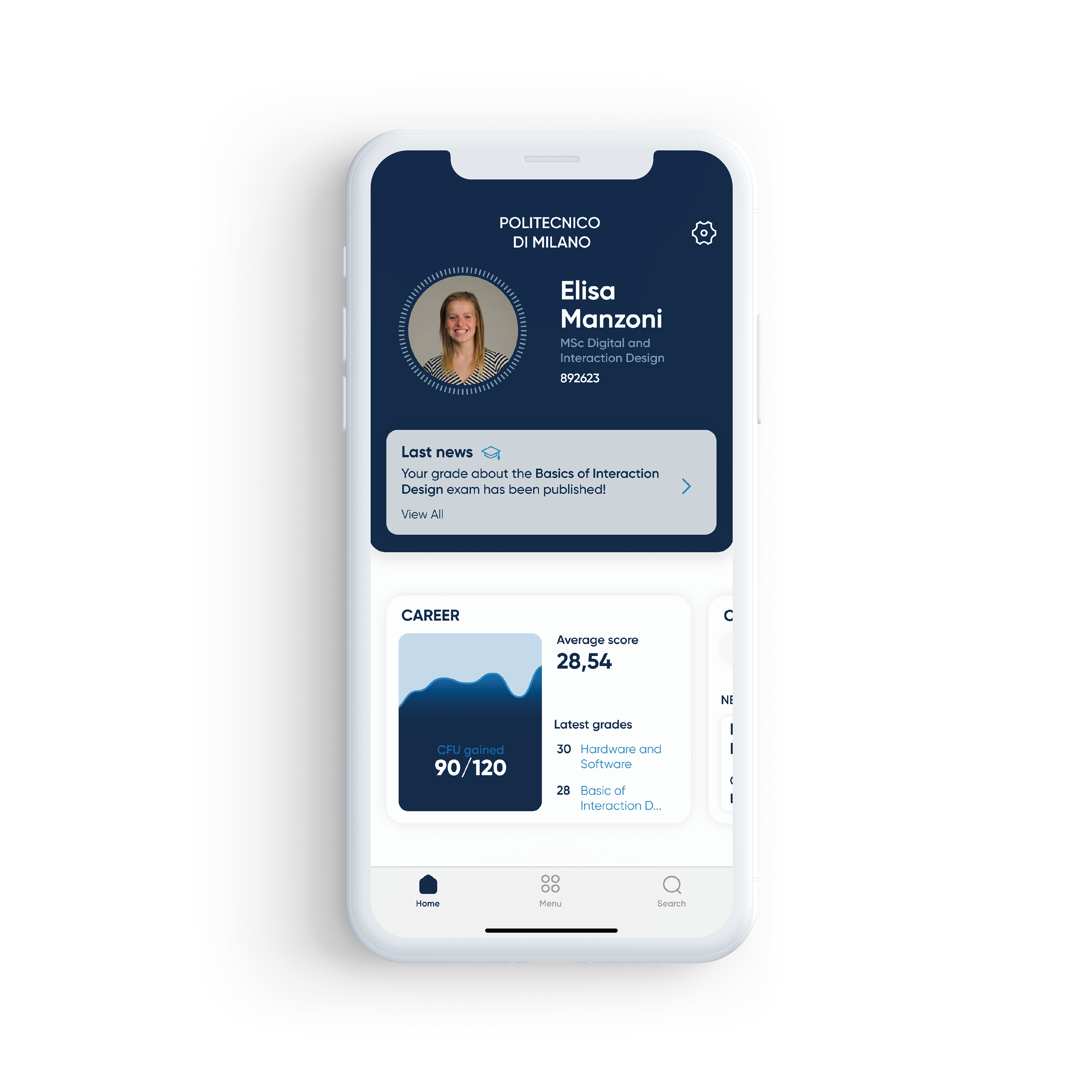
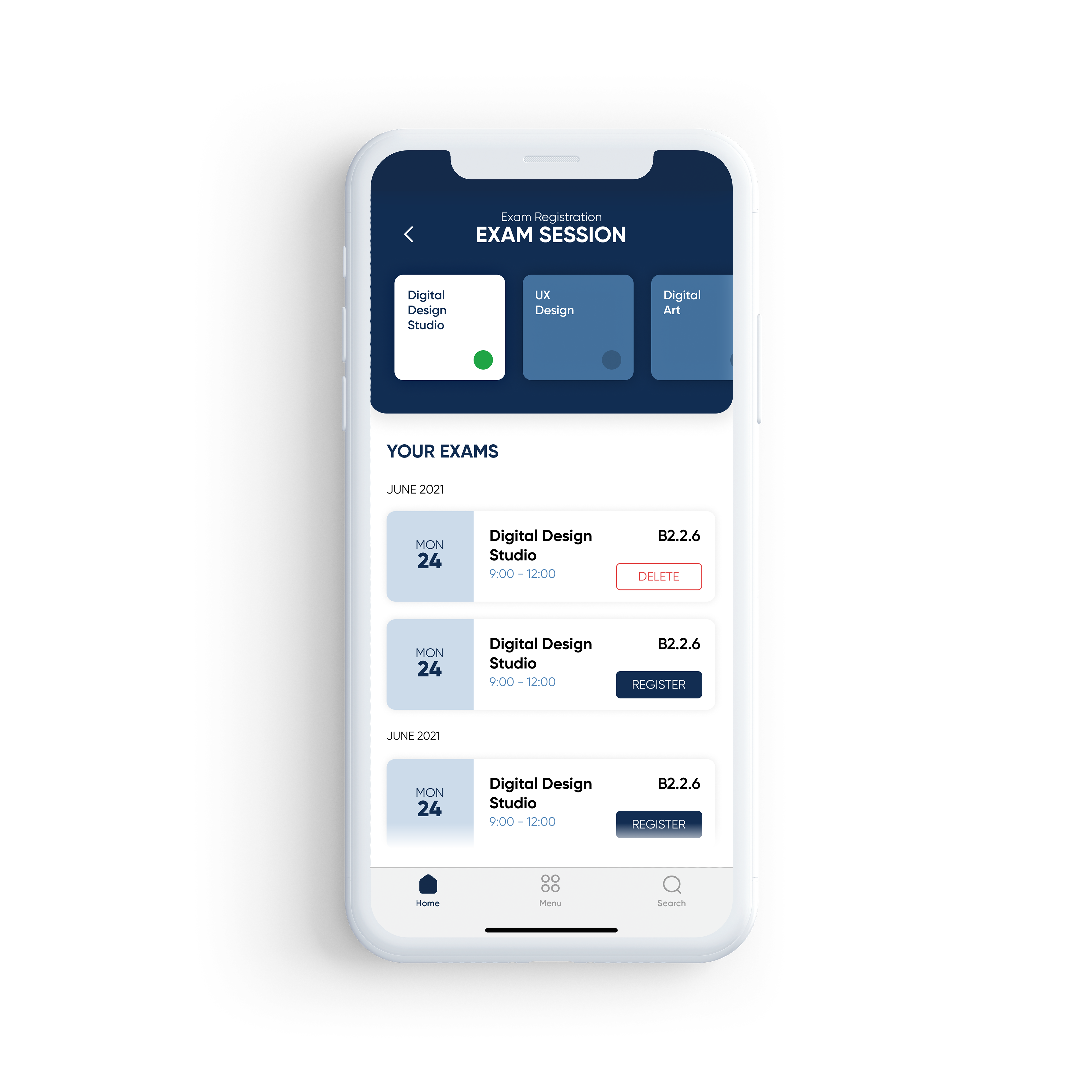
Design system and UI Design
Afterward, a new User Interface in compliance with the academic brand identity has been developed following a specific new wireframe of screens for each section.
In order to fulfill the strategic goals of customizability, speed of use, and hierarchical display of information, the team opted to exploit the potentialities of the widget element and its logic on the homepage.
Every screen is composed by:
- an upper darker header embedding the main information about the screen with a header showing the position inside the application,
- a lower section with a detailed display of information and controls for the specific section
- a 3-element navbar (Home, Menu, and Search).
User testing and conclusion
The project ended with deep User validation and testing. More than 20 students of different ages, departments, and study programs were selected to test the soundness of our concept. Users appreciated the effort made to improve the customizability and ease of use in the accomplishment of tasks. The inclusion of users at all stages of the process, from research to concept development and final validation proved to be a game-changer in such a complex user context like the university.