Motorbike HMI
UI Design
Time
Client
Project type
Role
March 2025
Model 5
Transportation UI Design
Designer
Tools
Figma, Blender, After Effects, VRED
Problem understanding
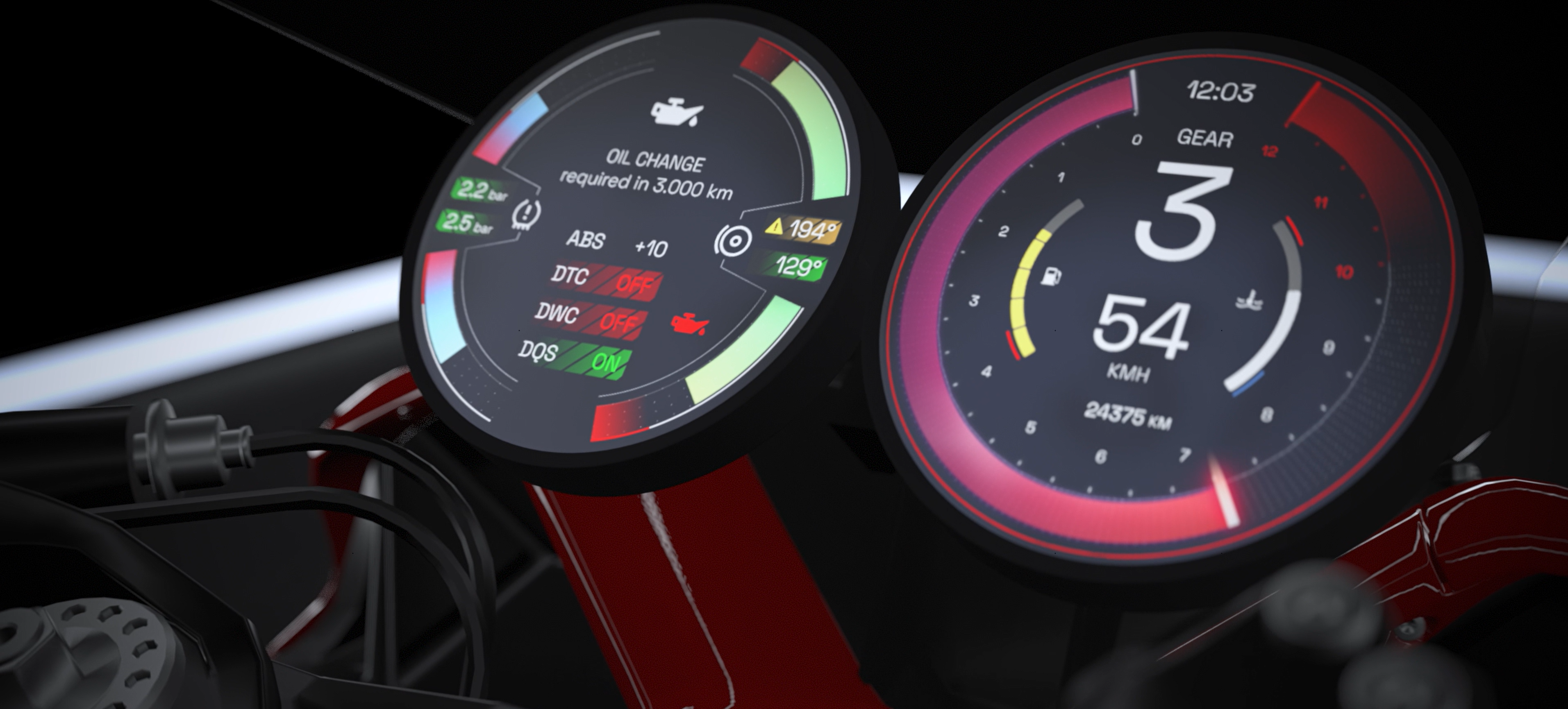
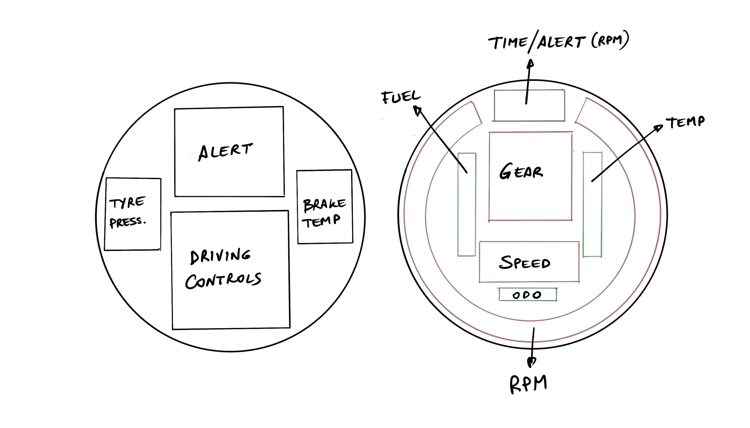
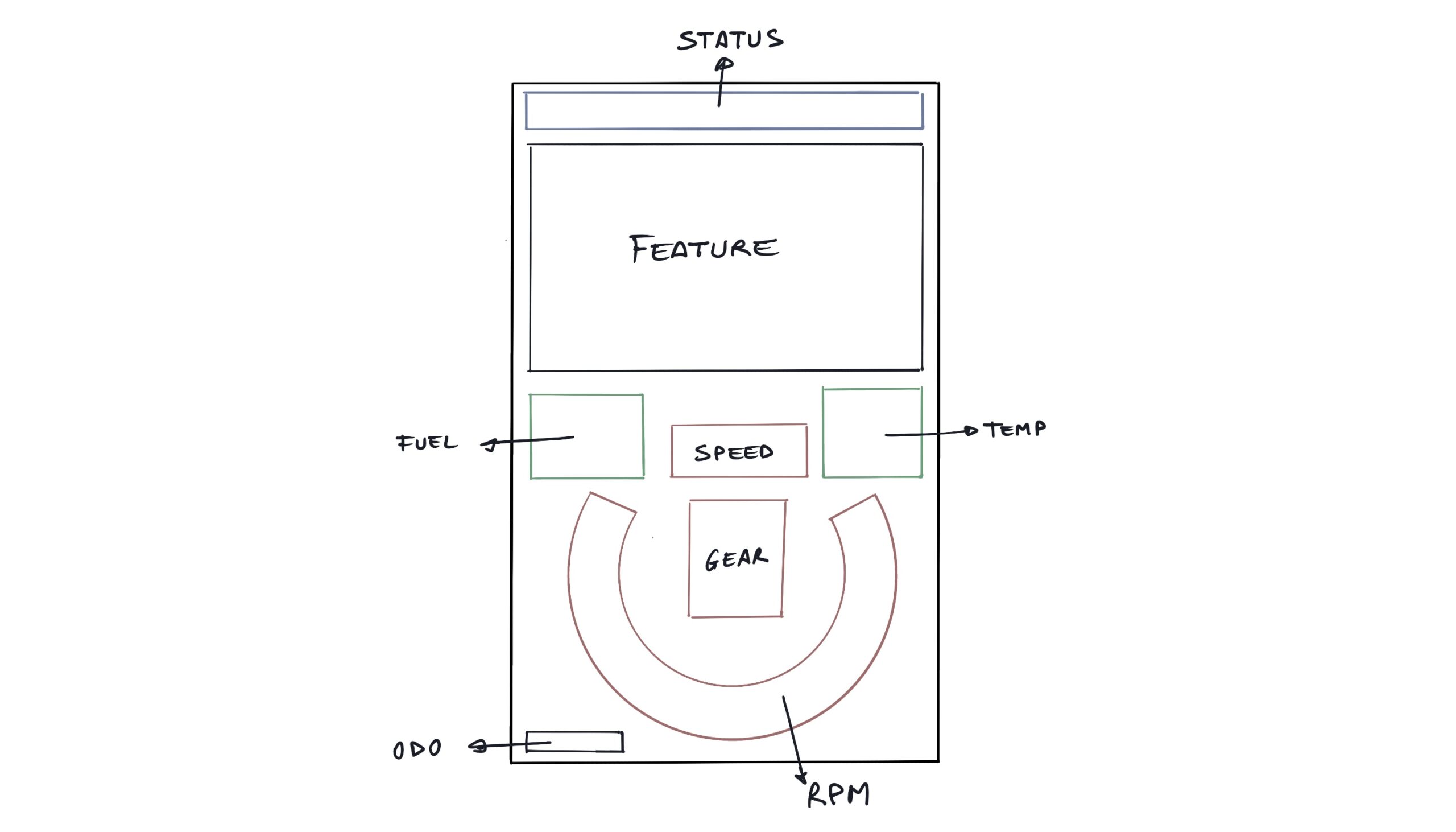
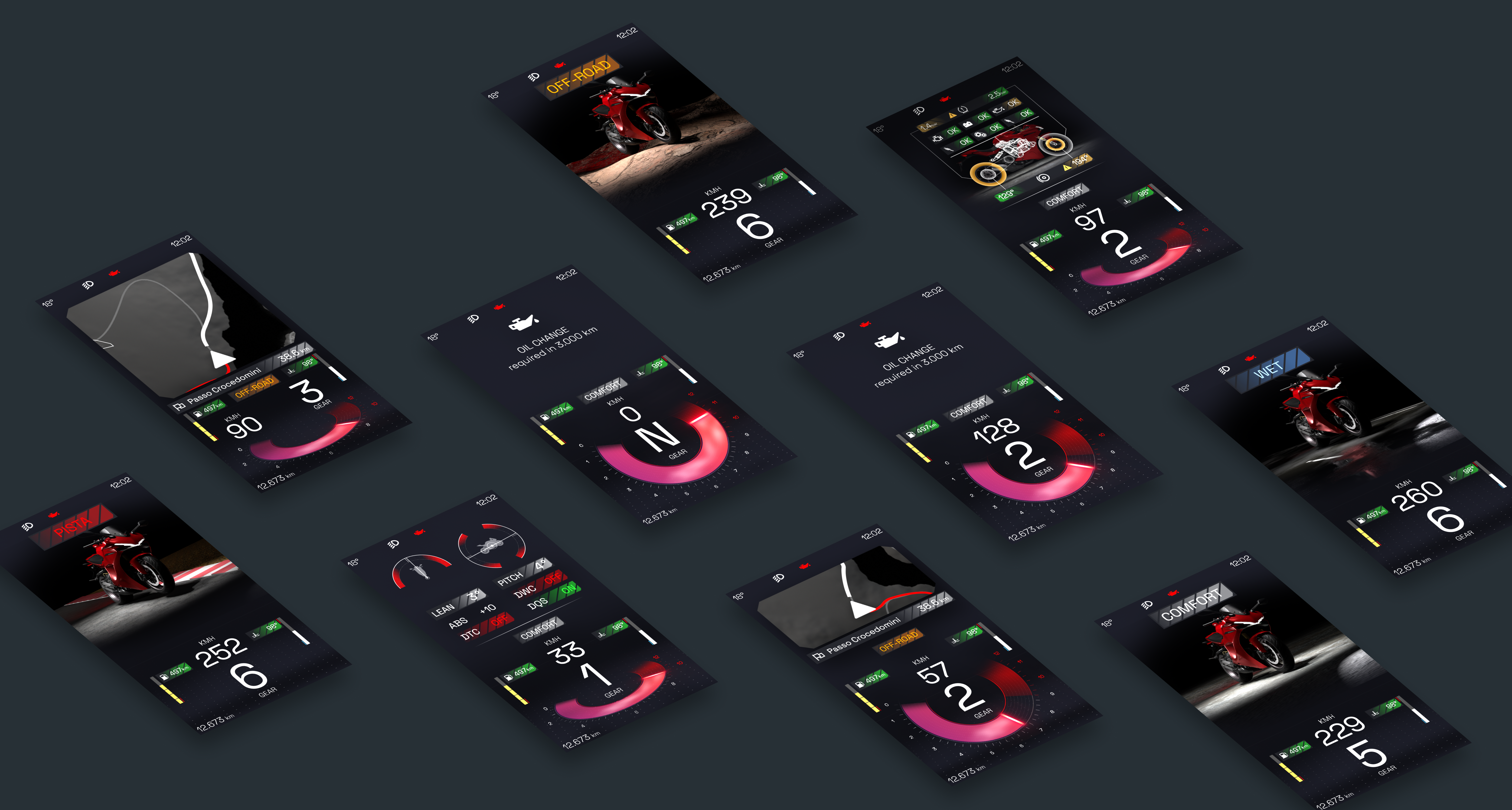
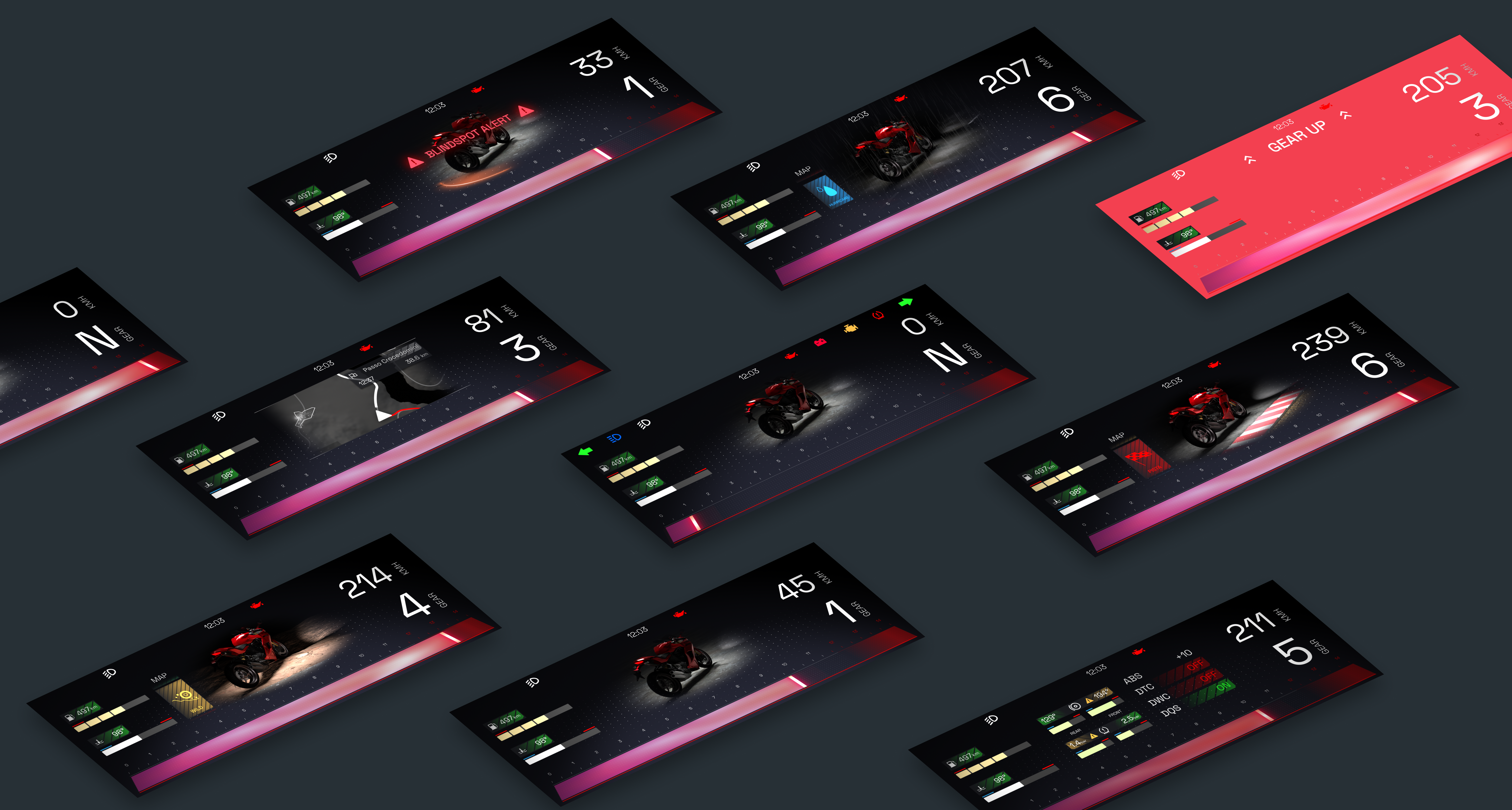
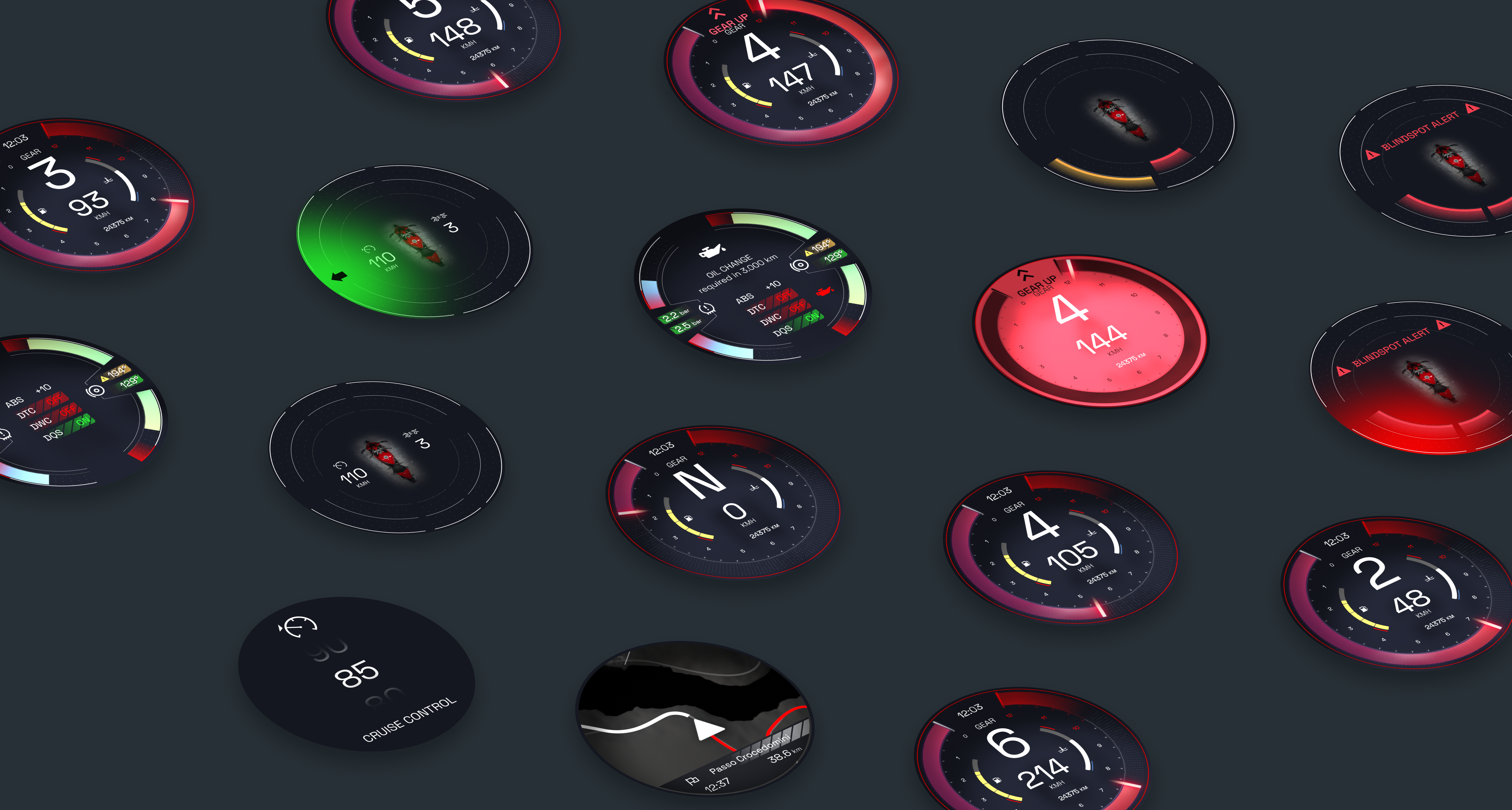
Motorbikes, while compact and dynamic, often lack advanced, user-friendly digital interfaces compared to cars. Riders typically interact with limited dashboards that provide minimal information, compromising usability, safety, and experience. The goal of this project was to design a modern HMI system for motorbikes that balances information delivery, rider focus, and aesthetic appeal across three screen types derived from three different types of motorcycle: ultra-wide (sportbike), dual round screen (touring), and portrait (adventure/enduro).
Research
The research phase combined competitive benchmarking, user interviews, and task analysis:
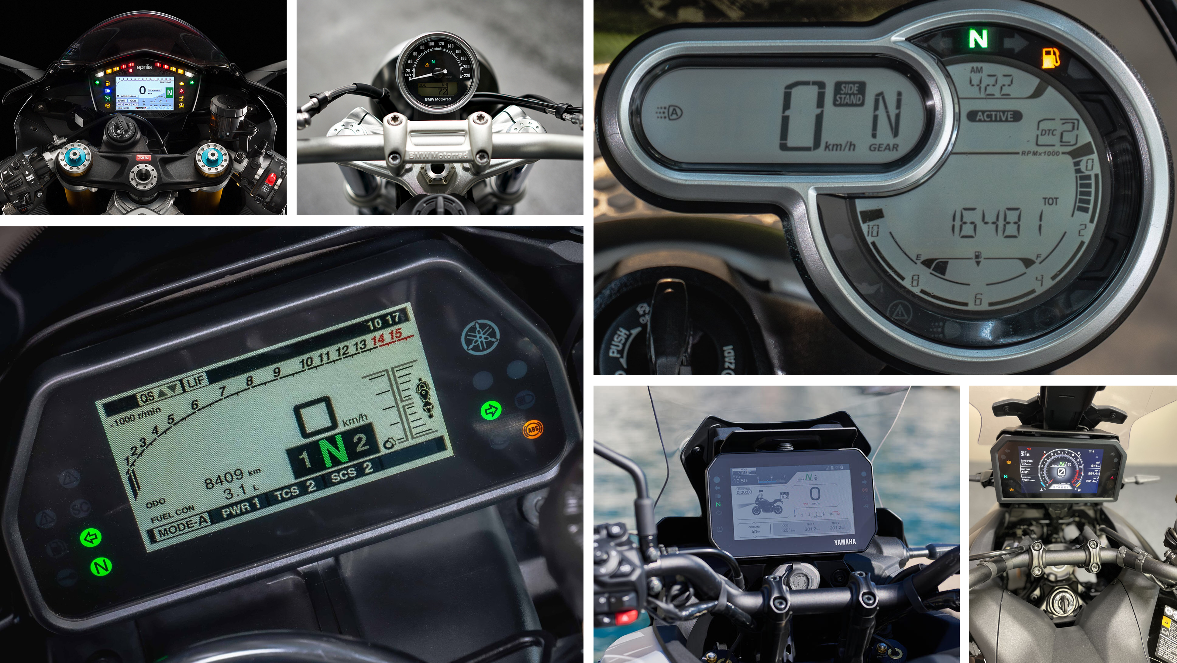
- Competitive Analysis: Studied existing motorbike HMIs and automotive digital clusters to identify best practices and gaps.
- User Interviews: Conducted interviews with motorbike riders to understand needs, pain points, and expectations related to information display while riding.
- Task Analysis: Defined critical user tasks (speed monitoring, navigation, alerts, maintenance reminders) to ensure the interface supports rider focus and safety.
Key insights highlighted the need for minimal cognitive load, high visibility in diverse lighting conditions, and prioritized information hierarchy.
To capture a comprehensive view of user expectations, I conducted interviews with motorbike riders across different segments — including urban commuters, touring enthusiasts, sport riders, and adventure motorcyclists.
Despite their varied riding styles, all users consistently highlighted common shortcomings in current motorbike HMIs:
- Limited real-time information beyond basic metrics (speed, RPM, fuel).
- Poor visibility under different lighting conditions.
- Lack of intuitive navigation and contextual alerts.
- Overly simplistic or cluttered displays that fail to prioritize information based on riding scenarios.
These insights informed the design direction, emphasizing adaptable, rider-focused interfaces that address safety, usability, and segment-specific expectations.
Design
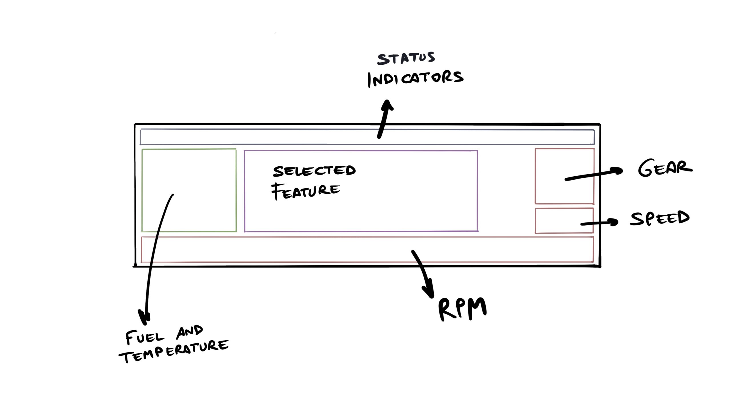
The design process started with wireframing to define the structural foundation of the three screen types — focusing on information hierarchy, spatial balance, and rider interaction flows.
Through multiple iterations, I refined screen layouts to optimize readability, minimize cognitive load, and create a visually balanced interface that supports fast glanceability during real-world riding conditions.
Once the wireframes were validated, I transitioned into visual design, establishing a coherent and modern aesthetic:
- A high-contrast color palette to ensure visibility across varying lighting environments.
- Typography with strong legibility to maintain clarity at high speeds and quick glances.
- Simplified iconography and micro-interactions that support intuitive understanding without unnecessary complexity.
- Visual consistency across all screens to strengthen brand identity and enhance user confidence.
The result is a design that not only functions seamlessly but visually elevates the motorbike interface experience.
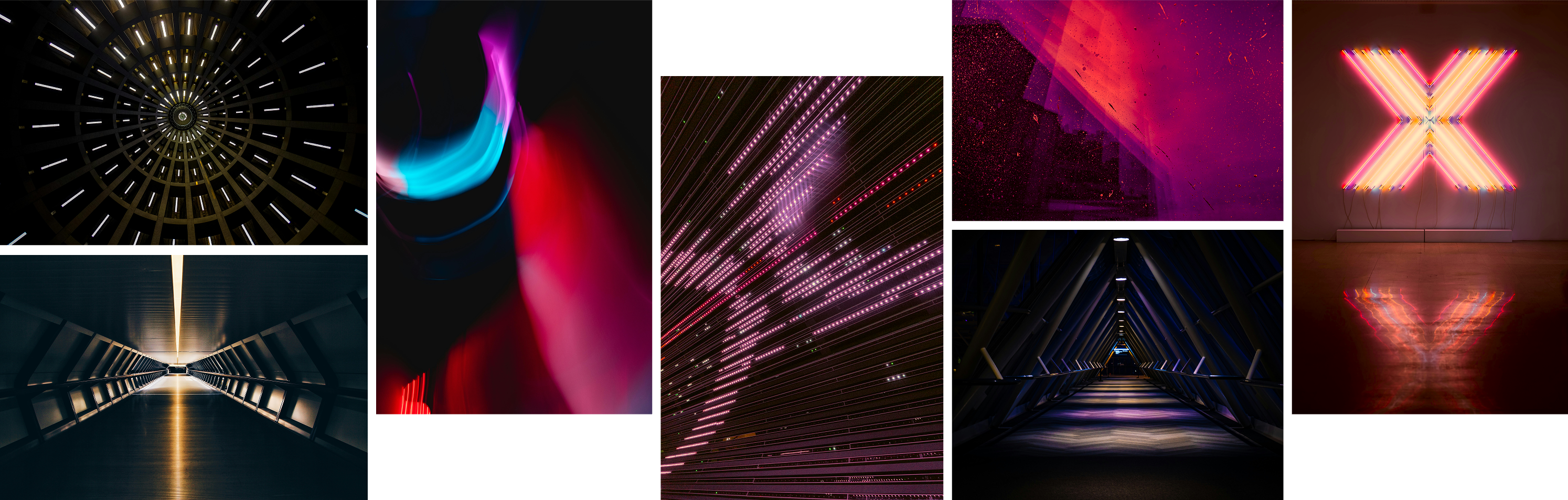
The visual foundation for a motorbike HMI concept centered around motion, energy, and precision. I drew from architectural symmetry, dynamic light patterns, and cyberpunk-inspired color palettes to create a style that feels both high-performance and emotionally charged. The interplay of deep shadows with vibrant neon accents—particularly magenta, cyan, and electric orange—evokes a sense of speed and futuristic control. Spatial perspectives and tunnel forms inform navigation flow and UI depth, while abstract light trails suggest responsiveness and real-time feedback. The goal was to build an immersive digital experience that resonates with riders: intuitive at a glance, striking in form, and deeply connected to the rhythm of the machine.
Visualization
The visualization phase started in Figma, where I created the core vector assets and defined the visual components for each screen. From there, I crafted micro-interactions and transition animations using After Effects and Blender, focusing on smooth, intuitive motion that enhances user understanding without adding cognitive load.
To present the final design in a realistic riding context, I integrated the animated interfaces into a 3D environment using Autodesk VRED, simulating the in-situ experience with accurate lighting, reflections, and camera movements. This full pipeline allowed me to deliver a highly immersive, presentation-ready video that communicates both the functional design and its aesthetic impact.